2020.08.08
An attempt to determine what "risk-adjusted returns" in PE and VC actually are
All investors seek strong risk-adjusted returns—some use Excel to try calculating this, others just stick their finger in the air. For starters, there’s not much agreement on the best way to measure returns in the private markets (though the flaws of IRR seem to be bemoaned more than others). And, the standard deviation of those returns doesn’t measure the risks investors accept (i.e. the potential for losses on our investments). The pursuit of alpha across private equity, venture capital, and the broader private markets remains fraught with underperformance amidst those debates.
One issue is the lack of data limited partners receive from general partners. Private funds (and their underlying portfolio companies) are valued quarterly, not daily like public market assets. Additionally, GPs are constrained in their ability to provide information to the LPs—their bandwidth is not unlimited, and they have to worry about making new investments (while helping the existing ones). What’s interesting to LPs can be distracting for GPs.
However, based on the data GPs provide, LPs can easily measure the following three types of risk:
The amount of capital invested in portfolio companies marked below cost;
The amount of capital impaired in those companies marked below cost; and
The amount of debt those companies carry (which is more relevant in private equity than in venture capital).
Of course, LPs also receive return data from the funds in which they invest (and from prospective GPs who aren’t afraid to send their performance [you’d be surprised]). With this data, LPs can see how much capital is invested in companies marked above cost, and what the gain is on that invested capital.
With this information, I created another framework to think about the risk-adjusted return proposition—or at least I haven’t seen anyone post it before, so maybe it’s new ¯\_(ツ)_/¯? The goal was to create a framework to apply across the entire private asset spectrum—outperformance can come from anywhere, whether it be private equity or venture capital or something that defies simple categorization, and investors shouldn’t be overly-wedded to any one source.
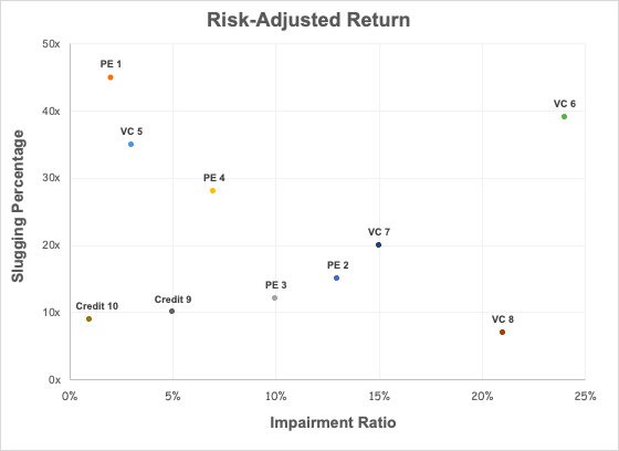
Risk in this framework is the ratio of capital impaired to total invested capital, the measure of how much of an investor’s capital is ultimately lost.
Returns are presented… differently. “Slugging percentage” would be a more accurate description, which I define here as the ratio of the dollar gain on investments marked above a 20% IRR to the dollar loss on investments marked below cost. I used IRR instead of the multiple on invested capital, as money does have time value, and IRR better allows for like-to-like comparisons across different strategies.

In the example above, PE GP 1 and VC GP 5 are exceptional at managing risk—they generate massive outperformance with minimal capital incineration. Credit GP 10 delivers less outperformance, though that’s expected given their credit investing focus. As one moves away from the left side of the chart though, the evaluation becomes more interesting: an efficient frontier emerges. One can argue whether or not PE GP 2 is a better investor than PE GP 3, but PE GP 4 is better at protecting capital while outperforming. Credit GP 9 may outperform slightly more than Credit GP 10 but does so while impairing much more capital (which is not ideal in credit investing). VC GP 6 may impair a lot of capital, but they do so while generating sizable outcomes. VC GP 8, however, sits in the “here be dragons” section of the chart, impairing capital with reckless abandon and little to show for it (which is also not ideal).
As with everything everywhere, there are caveats. Though I think IRRs greater than 20% are strong, that specific benchmark is still arbitrary. Like all models, it’s “garbage in garbage out”—including unrealized investments places an extremely high reliance on how specific GPs value their portfolios. Past performance also doesn’t predict future returns, and performance can erode over time as organizations change shape with additions and departures. Lastly, it doesn’t account for qualitative information, like the actual interactions LPs have with GPs, or what LPs learn about GPs and their portfolio companies through backchannels.
That said, I think this goes further towards answering the question of risk-adjusted returns than simply slapping IRR and standard deviation onto a chart. Despite the clear imperfections it does account for the dollars at risk, the dollars returned, and the degree of outperformance, while also evaluating a GP’s skill in portfolio construction. Applying some version of this framework could help an LP build a better mosaic in diligence on a GP, and maybe even lead to more artistic investing.
Hopefully, you made it this far—this edition was drier than most. Enjoy the rest of the weekend.


